

- Client:Gayle Rowcroft
- Categories:Branding, Development, Web Design
Gayle came to Faro looking for something that felt true to her work and the people she supports.
Her work centres around grief, loss, and major life transitions. It is deeply personal. That meant her brand and website could not feel corporate, busy, or overdesigned. It needed to feel calm, safe, and easy to engage with from the first moment.
This was about creating a space people could land on and feel understood straight away.
Logo Design & Branding
The brand was built around meaning, not just aesthetics.
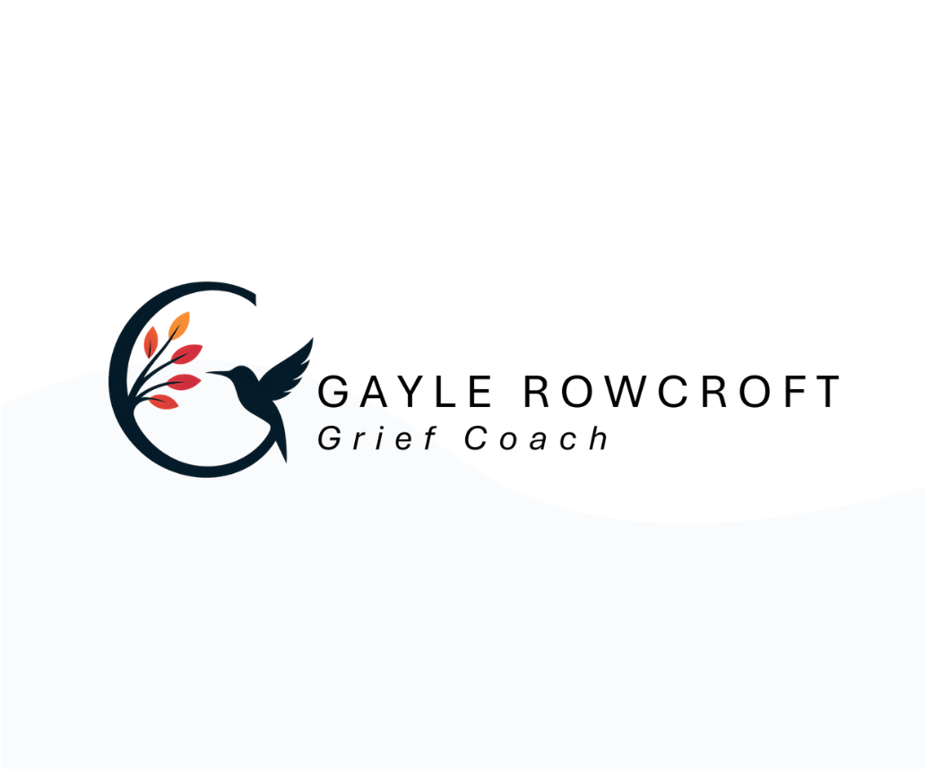
At the heart of the logo is a shape that subtly forms a ‘G’, giving it a clear connection to Gayle herself. Within that, the hummingbird was introduced as a symbol of hope and resilience. Combined with soft, nature-inspired elements, the overall mark feels personal and grounded rather than abstract or generic.
Every part of the logo has a reason for being there. It reflects Gayle’s story as much as her service.
The colour palette follows that same thinking. Warm, autumnal tones were chosen to create a sense of comfort and reassurance. Nothing harsh, nothing overwhelming. At the same time, accessibility was a key consideration throughout. Colours were tested to ensure strong contrast and readability, particularly for neurodivergent users, making the brand as inclusive as possible.
Typography played a similar role in bringing everything together. We chose Aptos as the primary font to align with the documents and materials Gayle already uses across her business. It keeps everything consistent and familiar, whether someone is reading her website or engaging with her elsewhere. It is clear, easy to read, and fits naturally within the tone of the brand.
The end result is a brand that feels personal, warm, and considered. It reflects Gayle as a person, not just a service.
Website Design
The website design focused on making things feel simple and easy from the first interaction.
Visitors are often arriving during difficult moments. The last thing they need is a confusing or cluttered experience. So the approach was to strip things back and guide people gently through the site.
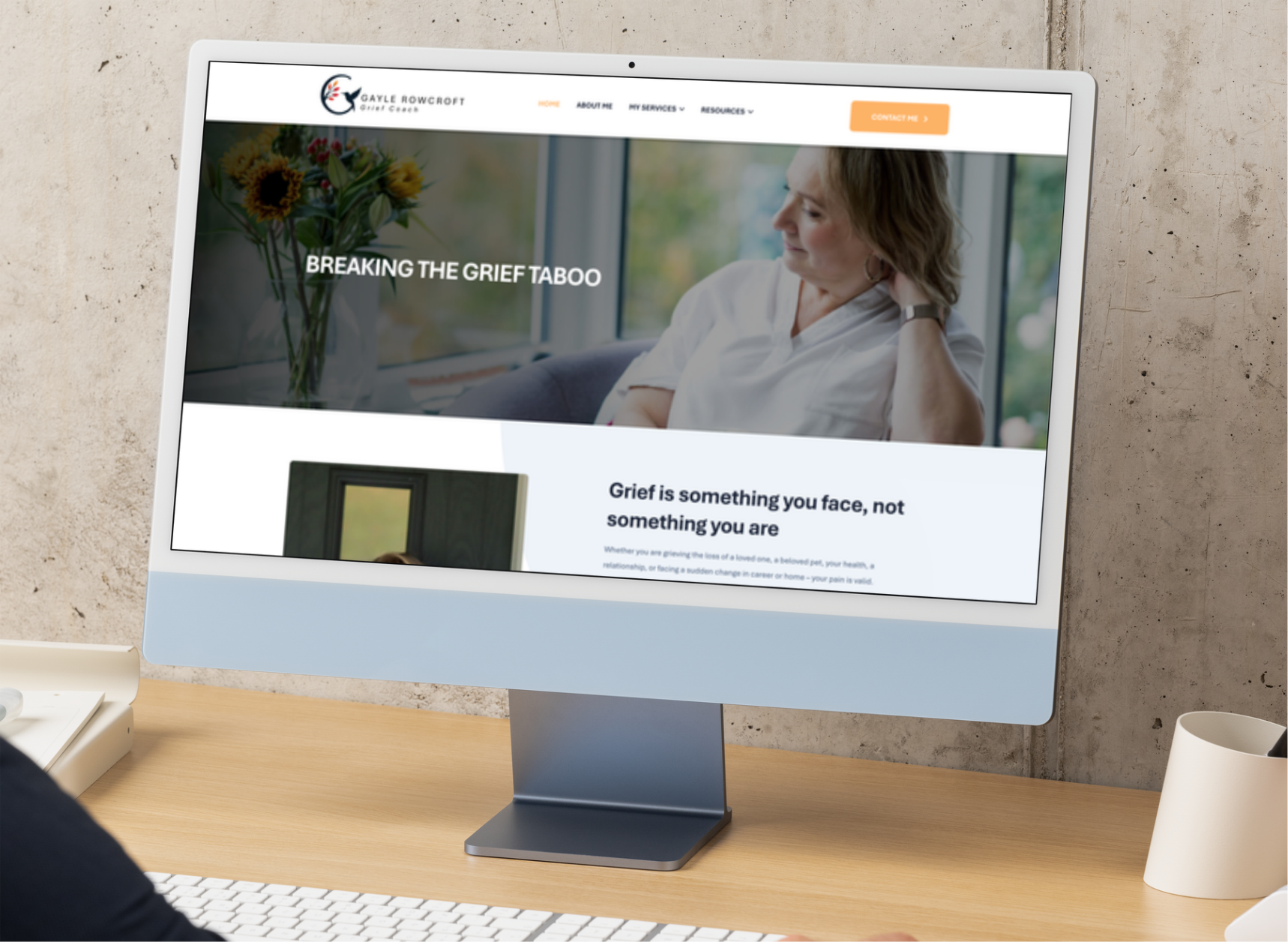
Navigation is clear and straightforward. Page layouts are structured to be easy to scan, with short sections, clear headings, and enough space to avoid any sense of overwhelm. Nothing is fighting for attention. Everything is there for a reason.
The visual design follows the brand closely, using the same colours, typography, and tone to create a consistent experience throughout. Imagery was kept natural and relatable, avoiding anything that felt staged or overly polished.
Conversion was always in mind, but handled in a way that fits the context. Calls to action are clear without being pushy. The site reassures rather than pressures, giving people the confidence to reach out when they are ready.
Website Build
The build focused on making the site reliable, fast, and easy to manage.
Behind the scenes, the structure is clean and built for performance, helping pages load quickly and run smoothly across all devices. The site is fully responsive, so whether someone is browsing on their phone or sitting at a laptop, the experience stays consistent.
Just as important was making sure Gayle could manage the site herself. The setup allows her to make updates without needing technical support, giving her full control as her business grows.
Accessibility was built in from the start. Clear font sizes, strong contrast, and logical page structure all help ensure the site works well for a wide range of users and aligns with the inclusive thinking behind the brand.
The Outcome
The final result is a brand and website that feel aligned with Gayle’s work.
It is calm, clear, and easy to engage with. It creates a sense of trust without needing to say too much. Most importantly, it supports people in the right way at the right time.
A digital presence that does exactly what it should. It makes things easier for the people who need it most.