- Categories:Branding, Development, Web Design
Branding and Logo
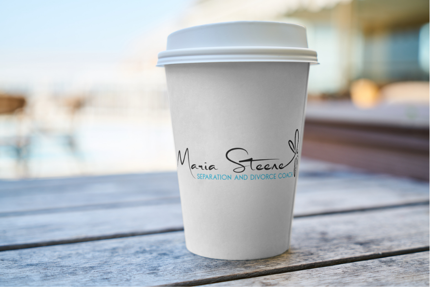
Maria’s work sits in an emotionally sensitive space. The logo needed to feel supportive and grounded without tipping into anything overly soft, spiritual, or vague.
We created a bespoke logo that balances warmth with strength. The mark is simple and symbolic, designed to represent clarity, transition, and personal growth. It’s intentionally understated, allowing it to feel timeless and credible rather than trend-led.
The logo works both as a full wordmark and as a standalone icon, giving Maria flexibility across digital platforms, social profiles, and future materials without losing recognition.
Colour choices were carefully considered to feel calm and reassuring, while still carrying enough contrast to remain clear and accessible. Typography was selected for readability and emotional ease, avoiding anything sharp, clinical, or overwhelming.
The end result is a logo that feels quietly confident and reflective of Maria’s approach: supportive, thoughtful, and grounded.
Website Design
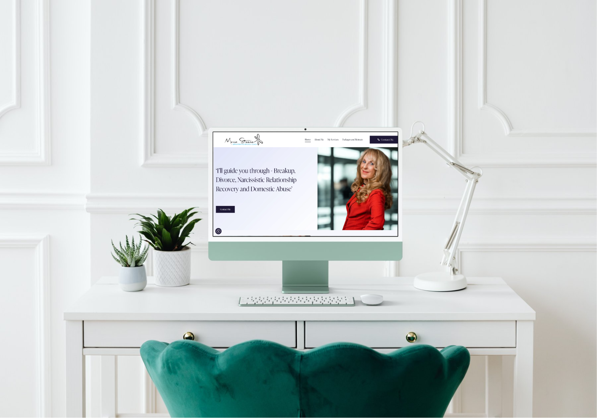
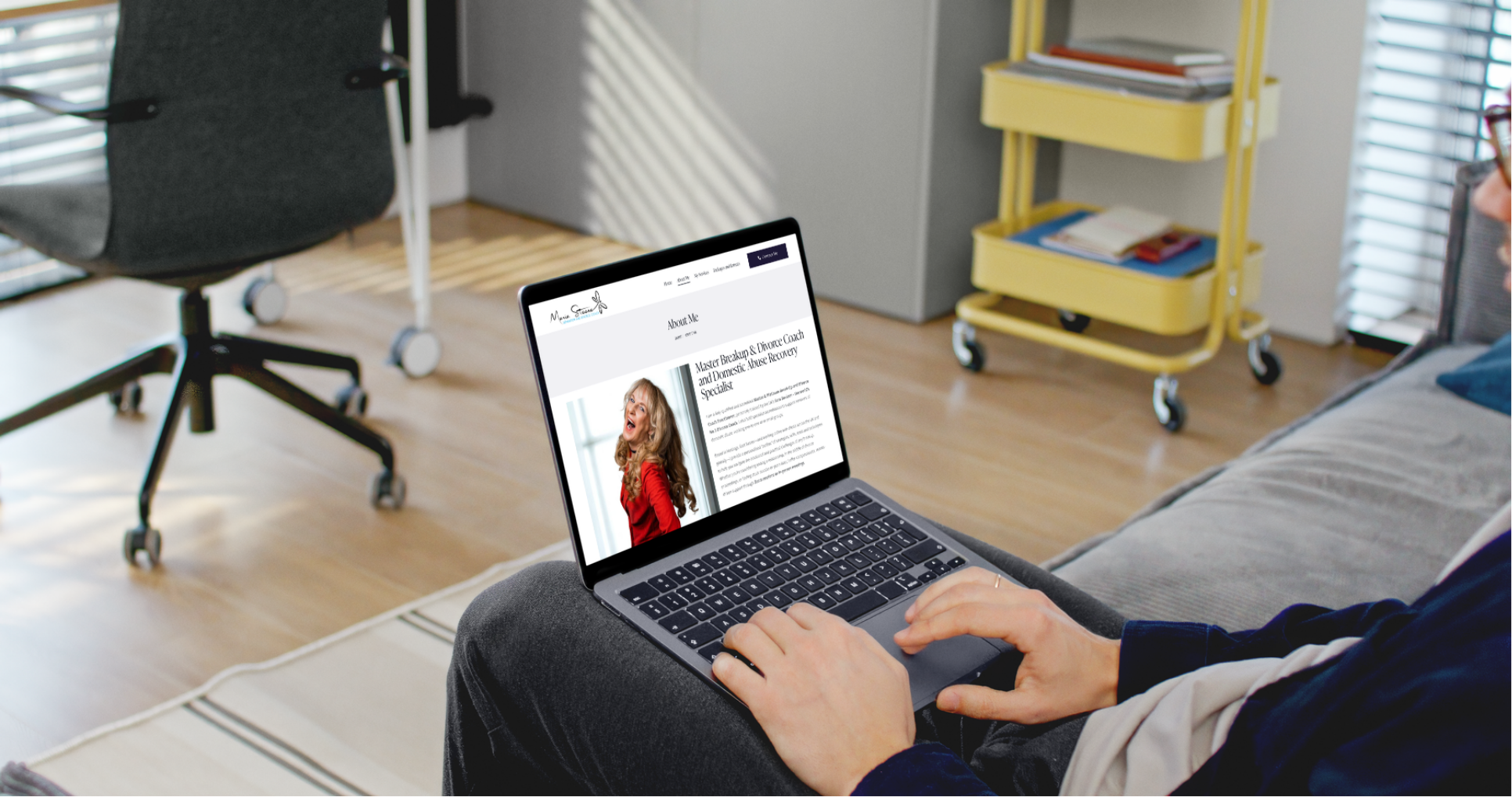
The website design focused on emotional clarity and ease of use.
Visitors to Maria’s site may be navigating difficult or uncertain moments in their lives, so the design needed to reduce friction and create a sense of calm from the first interaction. Layouts are clean, spacious, and intentionally paced, guiding users gently through the content rather than overwhelming them.
We prioritised clear structure, consistent visual language, and plenty of white space. Headings, body text, and calls to action were carefully balanced so users can quickly find reassurance, understanding, and next steps.
The design closely follows the brand identity, ensuring the logo, colour palette, typography, and imagery work together as a cohesive whole. The site feels personal and human, without ever crossing into unprofessional or informal territory.
Website Build
The website was built with performance, accessibility, and long-term flexibility in mind.
The build ensures fast load times, a clean content structure, and a smooth experience across desktop, tablet, and mobile devices. Maria can easily manage and update content herself, giving her confidence and control over the site moving forward.
Accessibility considerations were baked in from the start, including clear contrast, readable font sizes, and logical page hierarchy. This ensures the site works well for a wide range of users and aligns with the inclusive values at the heart of Maria’s work.
The finished website isn’t just visually calm, it’s technically reliable and easy to maintain.
Outcome
Maria now has a brand and website that truly reflect the nature of her work.
The logo provides a strong, recognisable identity, while the website offers a calm, supportive digital space that builds trust and encourages engagement at the right pace.
Together, they form a thoughtful, professional foundation that supports Maria’s practice and allows her to connect with clients in a way that feels authentic, reassuring, and clear.